Last Updated June 17, 2024
Whether you’re a freelance designer or an agency, your portfolio is your baby.
Not only is it a testament to your skills and experience working in the industry, but it’s the most important page on your website. It can make all the difference in whether or not you’re able to land another client and grow your business to the next level.
You can write yourself an epic bio that makes you sound like the answer to every business owner’s prayers, but at the end of the day, all your site visitors really want to know is: “What have you done before, and what can you do for me?”.
A common mistake marketing professionals make is treating their portfolios as passive showcases of their work rather than active sales tools.
We’ve done the research and spoken to experts on this very topic to share 5 ways you can set up your web design portfolio in a way that will turn your site visitors into paying clients (cha-ching!)
Why do you need a portfolio website?

Web design portfolios help you stand out from the competition and showcase your best work.
It doesn’t matter if you’re a freelance web designer or a digital agency — both need great web design portfolios to get their foot in the door. The benefits of building your own web design portfolio are invaluable:
- Showcase your design portfolio: The first goal is obvious — a web design portfolio becomes a centralized platform for you to showcase your projects and demonstrate skills and creativity.
- First impression: You know you only have one chance to make a first impression, so you better make it count. Having a good web design portfolio website lets you do just that — leave a lasting impression on potential clients.
- Reach a wider audience: Almost anyone can reach website design portfolios simply because they are online. This gives you greater access to potential clients, employers, and colleagues.
- Professionalism and branding: A portfolio website is also one of the major pieces in the self-branding puzzle.
- Link to other platforms: You can link a portfolio website to other platforms or social media accounts. This kind of interconnectivity enhances your online presence by helping interested clients to better explore your professional background.
Web design portfolios: Mandatory elements
As a designer, you are free to experiment and build a personal portfolio that truly reflects your design skills. However, some elements are considered mandatory for pretty much all portfolio websites. Here they are:
Homepage
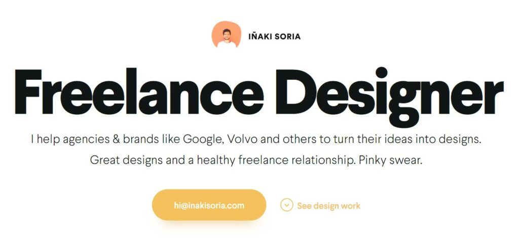
Create a visually striking homepage that provides a brief introduction to your expertise. That way, potential clients can immediately figure out what you do — just like in the example above.
About Me/About Us
Create a dedicated page that gives a comprehensive overview of your career and web design skills. This one should highlight your background, experience, design philosophy, and any other unique qualities that set you apart from other designers or agencies.
Portfolio projects
This is the heart of the website, so it requires special attention. You must include high-quality visuals along with brief descriptions of the project’s objectives and challenges. More about this in the next section.
Contact details
Make it easy for potential clients or employers to get in touch. Include a contact page with a contact form or email address, along with links to any social media profiles or professional networking sites.
Nice-to-haves
We’ll breeze through certain elements that are by no means mandatory, but it would be nice to add them to your online portfolio:
- Case studies
- Social proof/testimonials
- Resume
- Interactive elements for extra engagement
- A blog to prove your web and graphic design knowledge
6 tips for building a web design portfolio website

We got the basics covered, so now it’s time to focus on practical tips on how to build a killer web design portfolio.
1. Limit your number of projects you display
The very first thing to do is to think of your portfolio like your resume and put your best foot forward.
Do you really want to highlight the work you did during your first design internship, or for your very first client a good 8 years ago? Probably not. You’ve come a long way since then (at least we hope so).
When a visitor lands on your portfolio page to see 20 different web designs, old and new, it’s easy for them to:
- Get overwhelmed, not knowing where to focus their attention
- Form opinions on your skills based on outdated, or weaker designs
To give them the best user experience that you can on your site and make the best first impression, limit your portfolio to your top 3-5 website designs and leave it at that.
This portfolio by web designer Shawn Johnston is exactly what we’re talking about. His selection of 5 designs he’s proud of are all a visitor really needs to see to get the gist.
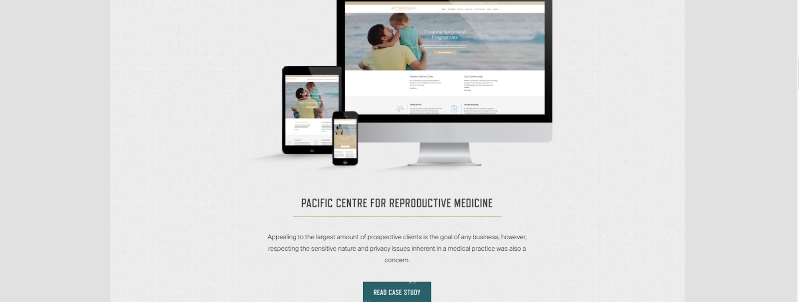
So, take a look at all your projects and narrow them down to what you’d consider to be your best. And just like you update a resume, you should always be adjusting these 3-5 designs as you create better work.
2. Make the buyer journey easy
Preston Lee, founder at Millo.co has been teaching freelancers how to succeed for over a decade. When it comes to building a solid portfolio, he’s done a great job at preaching how important it is to consider the buyer journey once a visitor lands on your website.
We chatted with him on the Agency Highway podcast a while back where he shared this advice:
“A good portfolio gets clients. It focuses on them from the time they get to your site to the time that they convert.”
PS you can listen to the episode here.
But basically, to summarize the discussion, if your goal is to turn site visitors into clients, then you need to make that process really easy for them!
Here are a few things you can do to improve the customer journey:
Minimize how many steps they need to take
Too many steps and you quickly lose people.
When you’re looking at your website with fresh eyes, ask yourself:
- Navigation or buried within menus?
- If they like what they see, how many pages do they have to go through before they can find a contact form?
- Is your email address clickable, or do they have to go through the pain of manually copy-pasting or typing it in to reach out?
Now that you have a few ideas, review every possible path and action on your website, and look for some ways you can make them easier
Include clear Calls to Action
People are a lot more likely to do what it is you want them to do if you ask, or tell them to. We can’t stress how important it is to include some strong Calls to Actions (CTAs) on your portfolio site. Some ideas for copy are:
- Hire me
- Contact me
- Book a free consultation call (we love this one!)
- Let’s chat
- Get a quote
- Get an estimate
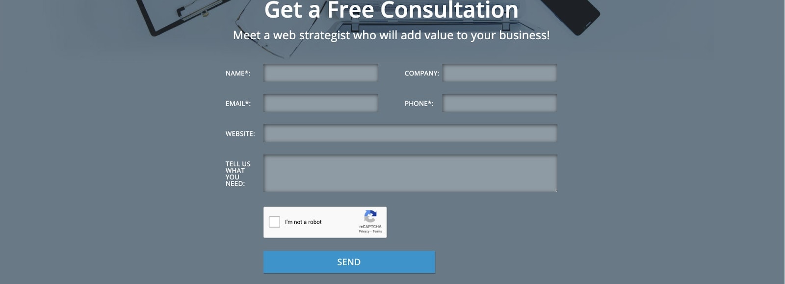
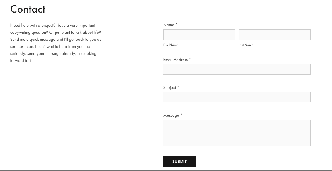
It’s easy for a site visitor to browse through a pretty portfolio and walk away if they aren’t pushed to take action. Contact forms like this one below are a great way to capture a visitor’s information when they’re browsing your site.
But a very important word of advice, make the form easy for them too by only asking for their name, email address and phone number. Too many questions and they’re less likely to submit.
Get rid of awkward dead-ends
Dead-ends are pages on your website that just kind of end with nowhere else for the visitor to go, but bounce away from your site. And you don’t want that!
To avoid them exiting your site or having to push the back button, make sure every page on your site leads to another page on your site.
Here are a couple of examples we liked that do it well:
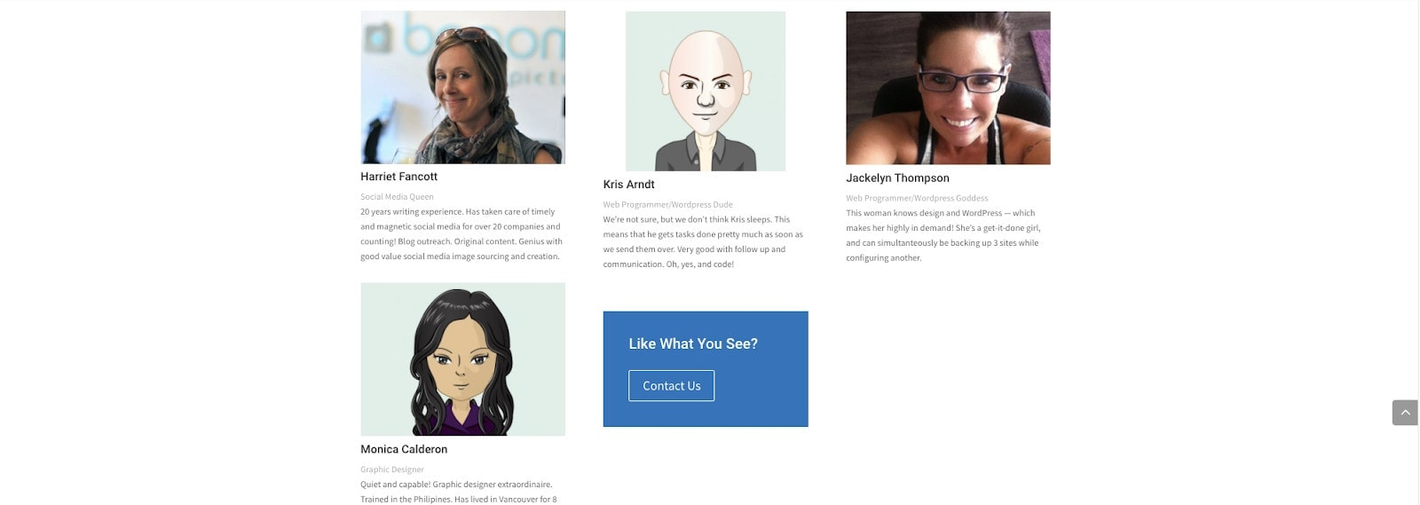
The first one ends off its team page with a Call to Action and a link to its contact form.
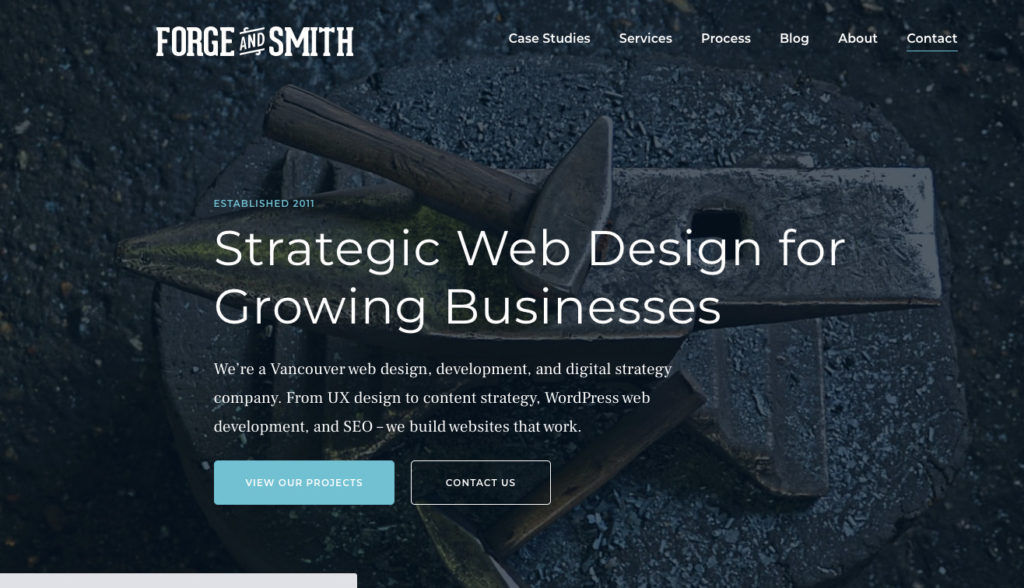
And even on the home page, this website gives you a couple of options for where you can go next.
Always be sure to link within your site rather than away from it to keep your visitors on your site.
3. Write for them, not for you
Out of all conversations we had with Preston on the Agency Highway podcast episode, some of our favourite advice was to take a long, hard look at your copywriting to make sure you’re writing for your visitors, not for yourself.
Too often, portfolios agency websites sound like “me, me, me”, or “we, we, we.” ... kind of shocking when all we ever talk about is how great we are at putting ourselves in the customer’s shoes.
So why aren’t we practising what we preach?
Let’s say you’re a business owner of a company looking for someone to design your website because you know you suck at doing it yourself. Which of these two statements makes you feel like the web design agency can help you out more?
- We build aesthetic, functional, and user-friendly websites for clients across industries.
OR
- Enhance the look of your brand, sit back, and watch your sales roll in faster than they ever have before.
The latter is clearly the winner.
Why?
What statement B succeeds in is giving the reader the feeling that the agency understands their goals, frustrations, and what it is they need.
In other words, it shows that the agency really “gets” the client.
Keep this example in mind as you review the copy on your website. Repetitively ask yourself, is this sentence about me, or about them?
You might be really surprised with how many “me/we” statements you actually find.
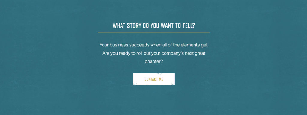
Here’s an example of some good copy:
4. Use conversion metrics to optimize your site
There are plenty of different platforms you can host your web design portfolio on, and many factors to consider before you make your choice.
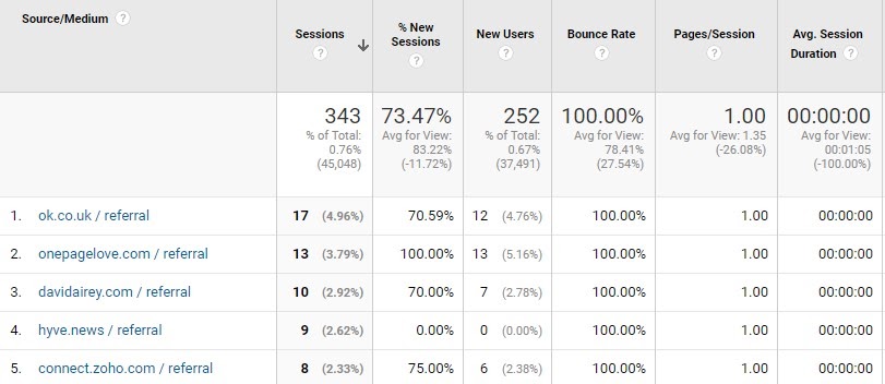
Whatever it is you choose, you’ll want to connect your site with tools like Google Analytics to get data-driven insight into how people are behaving on your site. If you’re nerdy like us, this is really cool!
Some data you can look at is:
- Time spent on each page: Are they spending 10 minutes looking at your projects or quickly clicking through?
- Bounce rates: Are they sticking around on your site or peacing out quickly?
- Click through rates (CTRs) on your CTAs and buttons: Are they clicking to get more information or not really taking action?
Another tool we recommend you check out is HotJar. We LOVE the tool’s heatmaps that visually show you where your site visitors are clicking, tapping, scrolling the most when they’re on your site.
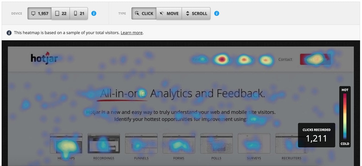
Tools like these will help you figure out what parts of your website are getting the most attention, and what parts aren’t appealing enough to your average visitor.
For example, if your heatmaps tell you that visitors are only scrolling so far down your site, it can mean you need to make your copy more enticing to keep them interested.
The more data you have on how visitors are acting on your site, the better you can optimize your design, copy, and CTAS to move them towards your goal of contacting you.
And, have fun experimenting with it!
5. Give context
Another common mistake that agencies and designers make is sharing a portfolio that looks like a bunch of work without much added value.
You might share screenshots of various pages of your website design, but where’s the story?
Why is that project impressive?
Take a few minutes to write up a short snippet for each portfolio piece and include some information about the client and some background story.
- What was the problem the client had when they came to you?
- What was their pain point?
- How did you solve their problem and make their business better through your design?
- What features can you call out that you’re particularly proud of?
It doesn’t have to be a full-blown case study, even one line will do. We like how web designer Kyson Dana shares how he added value to this project in his portfolio here:
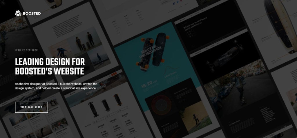
It never hurts to tell visitors a little more about the project so they understand how you work, and what value you bring.
Props to Shawn Johnston a second time for how he did this on his site too:
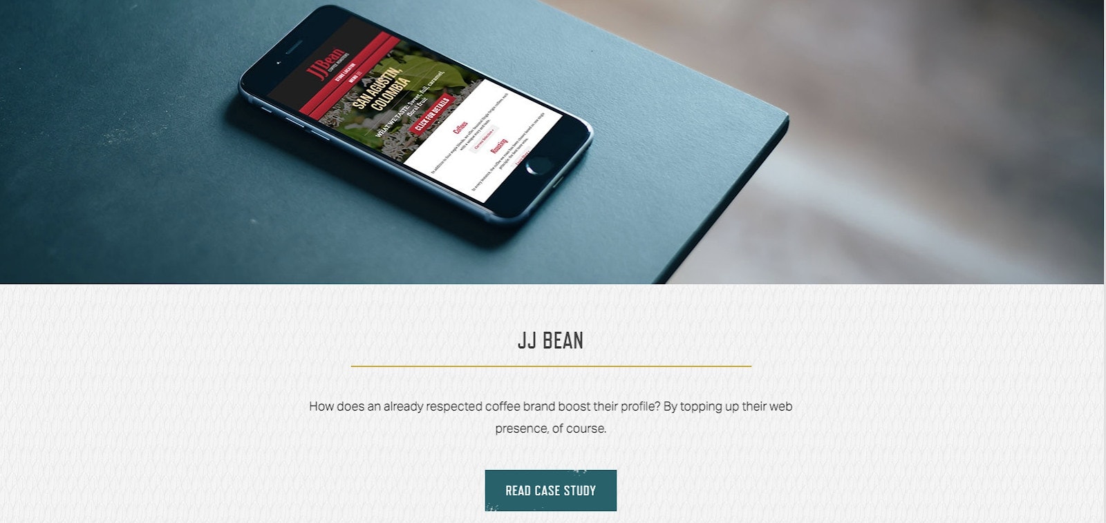
6. Be a little transparent!
A final word of advice is to help your website visitors out by being transparent about your offerings.
As you display your web designs in your portfolio, it’s not a bad idea to share a range of pricing for what such projects might cost them as a client.
Of course, it’s hard to be specific, so that’s why we recommend a range by saying something like “projects like this typically cost between $2000 to $5000”.
Not only are you helping the visitor by cutting out the step of them needing to reach out to seek more information from you, but you’re also helping yourself out by qualifying your leads.
When you offer a pricing range upfront, you know that whoever reaches out to you has got the budget for your services.
That ends up saving you a lot of time going back on forth on negotiations too!
Up to you
So, there you have it!
Whether you’re building a new web design portfolio from scratch or looking to beef up your existing one, we hope these tips come in handy.
Which of these tips gave you the biggest “aha” moment? Let us know which one you’re excited to implement in the comments below.


Great article! I've saved a couple of tips! Thanks a lot for your efforts!
~
Max
Thanks Max glad to hear it!